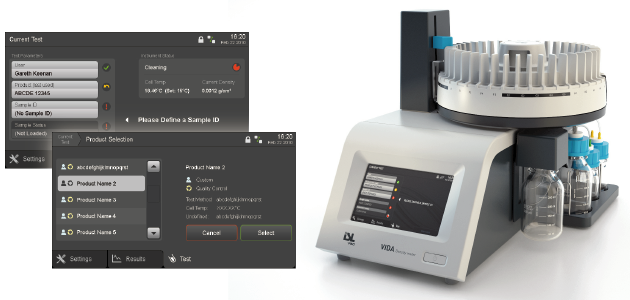
VIDA Density Meter: UX design for industrial lab equipment
 |
Relevant keywords
Laboratory instruments, user interface design
Design goal
A more user friendly interface was required as part of the latest version of the VIDA density meter, in order to support the less experienced users that PAC is targeting with the new design of the equipment.
Specific role & contribution
- Project planning and management, including preparation of quotes and direct communication with client
- On-site visits and direct communication with developers
- Conceptualization and wire-framing
- Overseeing of styling activities
The Project
PAC is making a major overhaul to their family of equipment for industrial laboratories. As a first step, the VIDA Density Meter was to be redesigned both from a hardware as well as from a software perspective.
Product analysis & conceptualization
Based on product analysis and interviews with PAC engineers and product managers, the user interface of the VIDA Density Meter was found to require a much needed revision in order to become more user friendly. The new system should be able to support the less experienced technicians that PAC was targeting with their new design strategy. Feedback, clarity and ease of use were therefore of paramount importance.
Final styling
A styling proposal was created later on, and applied to several of the main screens in full mock-ups. Graphical assets were created for implementation, based on precise requirements in terms of slicing, colour depth and format needed by the software developers.


