ipNext: Usability testing and redesign of an office phone
Relevant Keywords:
Telecommunications, office environment, user research, usability testing, icon validity testing, redesign, office telephone
Design Goal:
The goal of this project was to evaluate the usability of the Alcatel-Lucent IP Touch 4018 office phone and to propose a re-design of the phone according to the findings of the performed tests. The team consisted of 6 Design for Interaction master students of the TU Delft working directly for Alcatel-Lucent, a global telecommunications corporation.
Project duration and team:
225 hours, 6 interaction designers (David Güiza Caicedo, Tine Lavrysen, Amine Rhord, Meike Mak, Steven Fokkinga, Marjolein Hartog)
Methods Used:
- Product analysis in terms of aesthetics and functionality
- Online user survey & interviews with experienced users to understand how they perceived the current phone.
- Usability tests of the current phone with novice and experienced users.
- Online icon validity test performed with an international sample of people.
- Interaction prototyping to assess the new interaction model proposed with the redesigned phone.
THE PROJECT:
Usability research
To find out how intuitive the IP Touch 4018 is and what usability problems emerge out of normal office use, we decided to perform some usability research at the Delft University of Technology (TU Delft) where the phone is widely used. The research consisted of a thorough analysis of the current product in terms of aesthetics and functionality, an online questionnaire with which 50 employees of the TU Delft were surveyed regarding their use of the phone, interviews with four employees who filled in the questionnaire and a usability test of the IP Touch phone which was performed with five participants who had no prior experience with the phone and one with experience, in order to assess how previous experience would affect the usability issues.
Some of the general research conclusions
Most of the primary functions are not used, either because they are not needed in their average day work (such as forwarding a call), or because their use is too complex and the users do not know how to operate them (such as the phonebook). Often buttons are not understood at all or are misinterpreted and the menu structure is perceived as extensive and unclear. The phone is not sufficiently intuitive in most use scenarios and there are several inconsistencies in the way feedback is given to the user.
The phone’s looks and ergonomics are perceived as good enough and fitting the office environment, yet a more attractive visual aesthetic could be achieved.
Description of the redesign
The ipNext
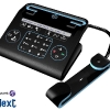
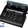
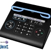
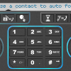
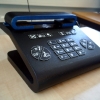
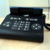
 The redesign of the phone offers a ‘downgrade’ from the current phone in the sense that it does not support as many functions as the IP Touch 4018, but just the basic functionality that could be used by an average office employee. It bears a basic and simple form, keeping in equilibrium straight and curved surfaces and shapes. The phone is black and the color blue is used as secondary color not only for decoration, but also for certain usecues. The functions are directly accessible through buttons with icons.
The icons were selected on the basis of the results obtained from an online scientific icon validation test in which 257 participants from all over the world took part. The buttons are grouped according to the moment of suggested or available use. This idea is further enhanced by the use of blue colored guiding lights surrounding each group of buttons. The guiding lights guide the user through the steps that he has to take in order to complete a chosen action. The redesign has a 30 character dot matrix display and text larger than 30 characters will automatically scroll.
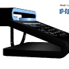
To set the phone in hands free mode, the user must place the handset sideways on the blue slot above the base (see in the pictures below). This way of putting the phone in handsfree is a more physical action and the user can direct his/her voice towards something in stead of a ‘closed box’.
Testing the usability of the ipNext
To find out how intuitive the redesign was, a second usability test was performed in which six participants used a flash model to interact with the intended interaction model proposed by the ipNext and a for which also a wooden aesthetical model of the final design was made.
The usability test showed that the redesign is an improvement compared to the original IP Touch 4018 phone. The functions which were put under direct accessible keys were reached quicker by the users, the feedback was clearer and the blue guiding lights helped participants to look in the right direction. And although some new problems were identified, most of them can be easily solved in further iterations of the design process. Some other issues such as the cross-cultural validity of the icons require further research.
My role in the process
- Performed a functionality analysis of the current phone
- Helped in the design of the initial usability testing session and the analysis of the gathered data
- Developed the online user survey for the TU employees
- Actively took part in the conceptualizing and styling process of the redesign
- Developed the online icon validity test
- Helped in the design of the final usability test
- Developed the final interactive prototype
- Worked on the presentation renders
SUPPORTING MATERIAL:
Documents (PDF)
- Usability testing and redesign of an office phone (TU Delft & Alcatel-Lucent) – Executive Summary
- ipNext – Redesign features
- Usability testing and redesign of an office phone (TU Delft & Alcatel-Lucent) – Final Report


